A Tribute To...
     The most frightening S ever,
      The Screen Gems 'S' Logo
                         by John S. Flack, Jr.
The image you see on the above television screen may seem innocent enough and not scary at all, but to many of us who watched television as small children in the mid 1960's through the early 1970's, it was the most frightening thing on TV. In exteme cases, it caused nightmares and prevented the viewing of programs that used the logo-which was shown after the closing credits. Some even call it the "S from Hell". I myself was one of these children, though not an extreme case. I was so scared by it I would just stare at it, though sometimes it would get to me and as the closing theme of one of the shows that used it was winding down, I would hide behind the sofa. Today I find this symbol an interesting piece of commercial art and worthy of its place in television history.
Shown on the above screen is the logo for Screen Gems, the television division of Columbia Pictures, that was used from 1965 to 1974. It was shown after the closing credits of now classic Screen Gems programs from this period-Bewitched, I Dream of Jeannie, The Monkees and The Partridge Family.
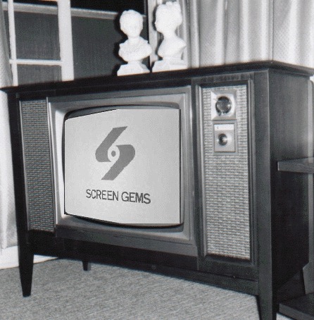
     The segment was accompanied by music that has been described as "creepy". CLICK HERE to hear a .wav file of this. It is a five second violin and synthisizer piece-six notes followed by two synthiesized tones. In 1971 this music was shortened to only three notes before the tones...CLICK HERE to listen. By this time I had outgrown my fear of this symbol, although the shortend version seems less scary. Most feel it was the music that made it so dreadfull.
Maybe it was the movement that was shown on the screen that seemed scary. The scene began with two parallelograms, one near the top center of the screen and one rising from the bottom of the screen. The top parallelogram was at a distance and moved in closer while the lower one was closer and moved away. They began to move together, growing in legnth. When they got close to each other the two sections wrapped around a dot, which simultaneously appeared in the center of the screen, forming the S. The dot may be ment to represent a hub of a film reel. While this was happening, the words "SCREEN GEMS'" came forward between the S and the bottom of the screen. Maybe all this action at once was too much for a young mind to comprehend. It was shown on a yellow background with the S being red sometimes, black other times. I think it looked more eerie on a Black & White set, when the background showed up as white and looked much colder.
Perhaps we felt sorry for the dot seeming to be captured and trapped by the two parallelograms. Some of the more neuotic viewers maybe felt the parallelograms would sneak up and capture them, maybe while they slept (hense the nightmares). Maybe the whole thing was planned to be a way to get us kids to watch less TV.
Whatever the reason we were so terrorfied by this, this closing logo will go down in TV history as one of the scariest. The S logo is practically extinct today, although current reruns of The Partidge Family and home videos of the show contain it. After 1974 the Sceen Gems shows mentioned above had newer Columbia or syndicator's logo replacing the S. Current motion pictiures by Screen Gems are using a new version of the S logo, the same design but now silver with a blue reflection on a black background..
I would say the creative mind or minds that created this closing logo segment did an excellant job, they made this icon so memorable even after all these years, and it still gives me the chills!


Need information on a television series or TV history?
                         Look no further than...
               Tim's TV Showcase                  
                         ...an excellant TV refrence!
This is an unofficial page and is not connected to the companies mentioned.
RECOMMENDED LINK...